Costudy
2025
Project Overview
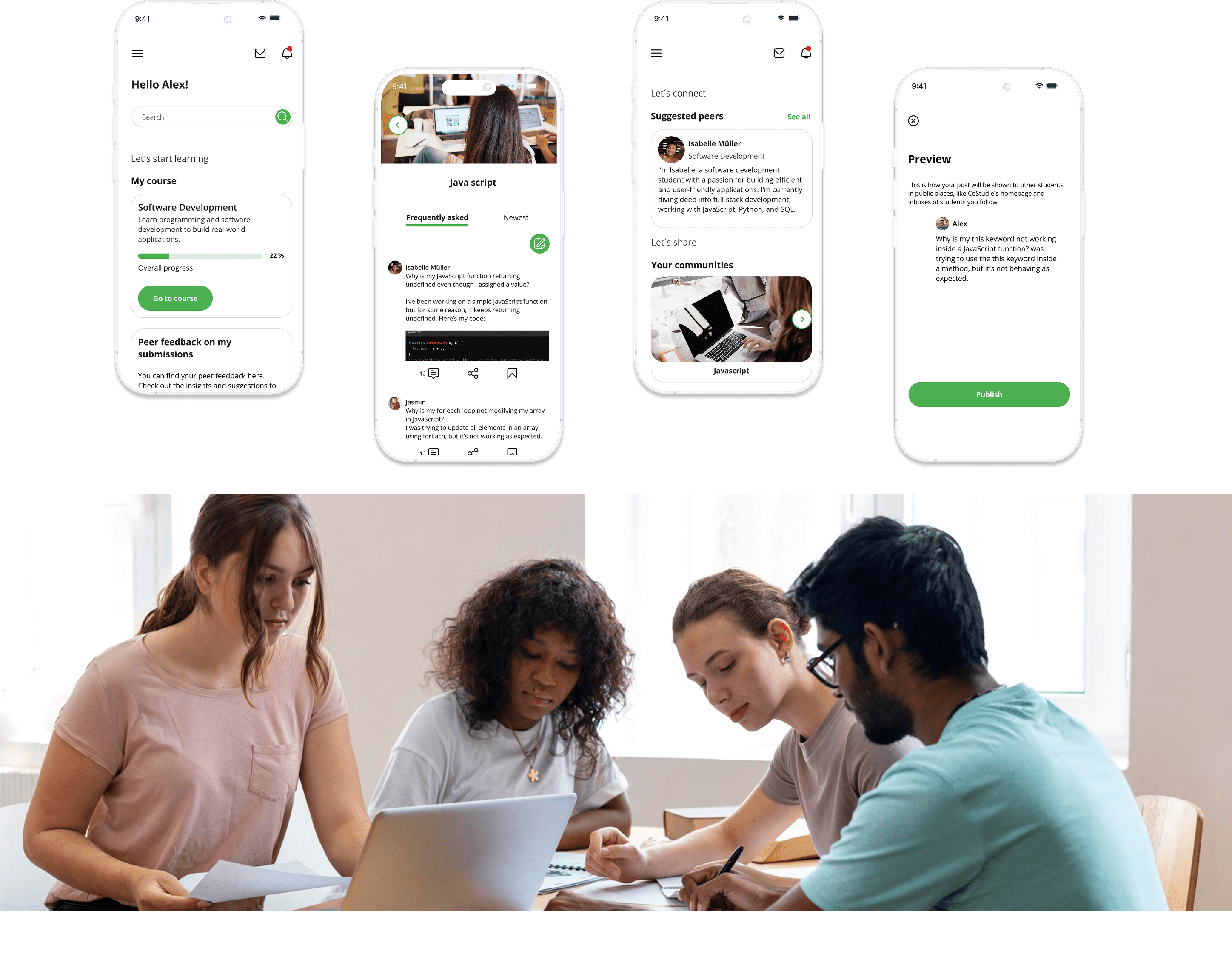
CoStudy is a responsive web app designed to connect students, foster collaboration, and enhance the learning experience. It enables users to connect with peers, collaborate on projects, and share knowledge, making studying more interactive and productive. Whether looking for study materials, peer feedback, or a team to work with, CoStudy provides the resources and community support to help students succeed. With its responsive design, the app ensures a seamless experience on any device, allowing students to stay connected and engaged wherever they are.

Process
Students balancing studies and daily life obligations aim to complete their courses efficiently while acquiring practical skills. They require access to relevant study materials, peer advice, feedback, and opportunities for collaboration with like-minded individuals.
Connect students online to facilitate peer-to-peer learning, support, feedback, and motivation.
January 2025 - March 2025
UI/UX designer designing an e-learning app.
Conducting usability studies, paper and digital wireframing, low and high-fidelity prototyping and iterating on designs.

Understanding the user
User Stories
As a new user, I want to create a profile, so that other students can find me.
As a new user, I want to find and connect with students studying my subject (or a related subject), so that we may collaborate.
As a frequent user, I want to be able to view and share articles, videos, images, and other files, and write posts for other students to read, so that we can share knowledge.
Starting the design
Sketches
Sketches were created to explore layout ideas and key interactions for the prototype. This early step helped visualise the user flow, quickly test concepts, and build a solid foundation before moving into digital design.

User flows
Onboarding/Log in

Find a peer

Follow community/Share a post

Usability Testing
I conducted one round of usability studies with three participants. Findings helped guide the designs from paper wireframes to mid-fidelity wireframes and address user concerns and improve the overall experience.
Findings
Users struggled to find the option to create/share posts or collaborate directly from the home screen, hindering quick engagement and content sharing.
Users were unsure where to publish posts, confused by student groups, and uncertain about the "open to all" option, leading to hesitation in sharing content.
Users wanted to find matching students or peers to collaborate with directly on the home screen as soon as they opened the app, making the process quicker and more intuitive.

Starting the design
UX Improvements
Communities, making it easier to share content. Students can quickly access their communities directly from the home screen, enabling seamless sharing and collaboration.
Joining a community allows students to effortlessly create and share posts.
Upon opening the app, students will be instantly matched with peers based on their field of study. The home screen provides quick access to these matches, making it easy to connect and collaborate right from the start.

Refining the design
Creating a moodboard
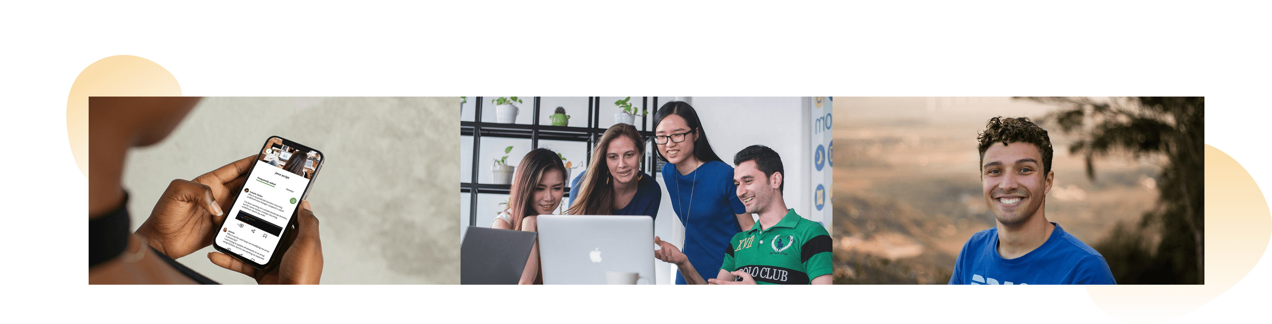
In this step, I created a mood board to gather inspiration and establish the overall tone.

Refining the design
Design System
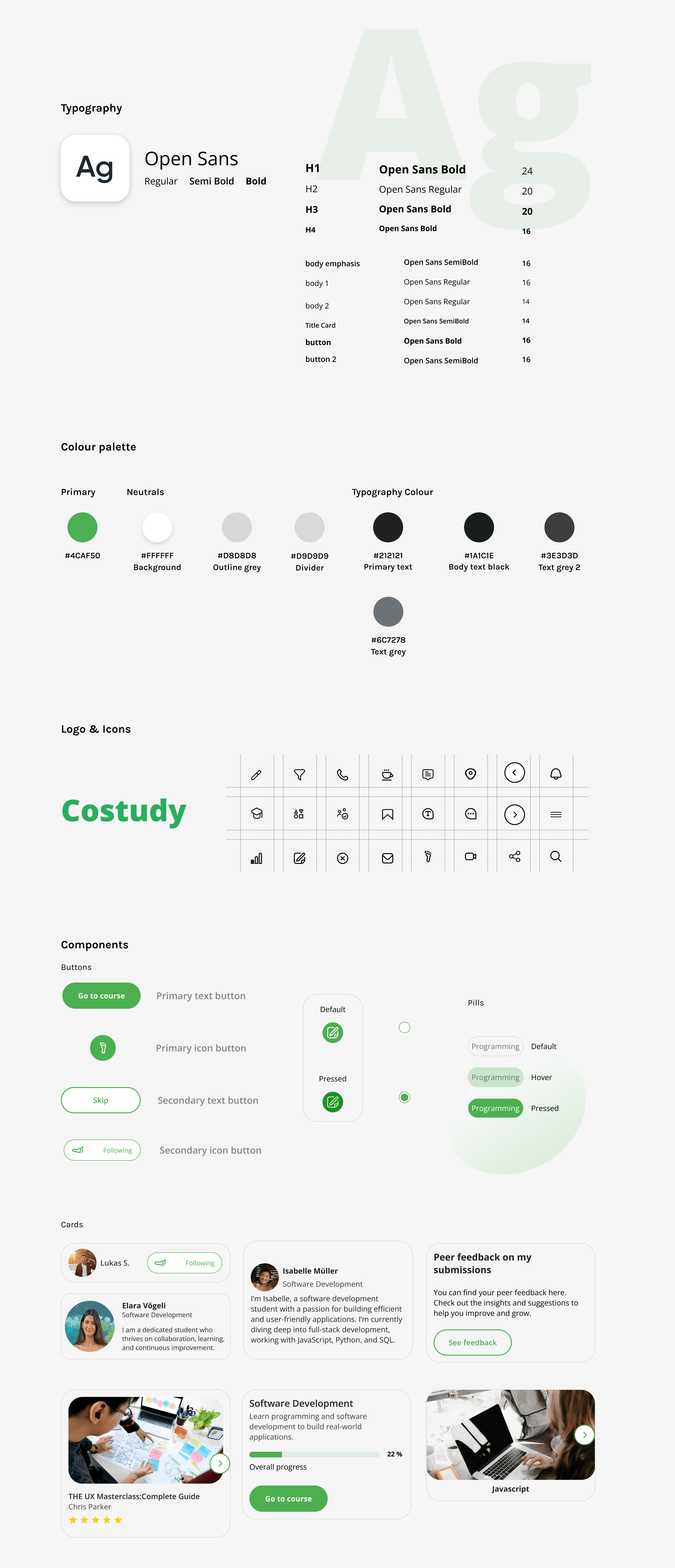
To see the full style guide click here
Going forward
Takeaways & Next steps
I learned how crucial it is to have references during the design process, as they provide direction and ensure consistency in creating a user-friendly experience. I also realised the importance of making navigation intuitive and ensuring that users can easily access the features they need. This should be thoroughly tested as well. The next step would be to conduct another round of usability studies to validate whether the pain points users experienced have been effectively addressed.